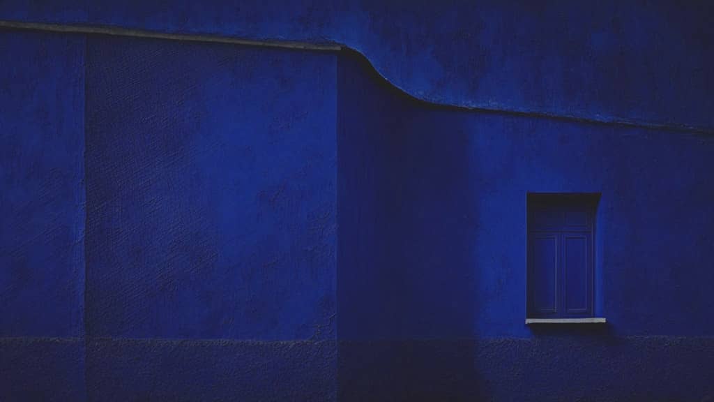
pattern design featuring ultramarine blue

The Power of Ultramarine: Its History, Symbolism and Influence in Art & Design

Ultramarine: a color that enchants, captivates, and inspires. Revered by artists and designers alike, this vibrant shade of blue, with its hint of violet, has long been a cornerstone of the creative world. In this article, we delve into the compelling journey of ultramarine, exploring its historic origins, its symbolism across cultures, and its prominent role in art.
Tangerine Orange wall with vibrant Orange color

Exploring Tangerine Orange: From Vibrant History to Cultural Symbolism

A burst of energy, a tangy zest, a vibrant hue that catches the eye – welcome to the world of Tangerine Orange. This lively color, named after the sweet citrus fruit, is a shade that embodies vitality, warmth, and excitement. In this article, we will journey through the engaging history of Tangerine Orange, discover its Pantone color codes, delve into iconic paintings featuring this lively hue, and unveil its cultural and symbolic significance.

A warm color palette inspired by the work of Edward Hopper

Embracing a Warm Color Palette: Finding Comfort in Edward Hopper’s Solitude

As the days gradually grow warmer, we still find ourselves needing a touch of warmth to dispel the lingering chill in the air. Today’s palette draws inspiration from Edward Hopper, the American artist celebrated for his poignant depictions of loneliness in the modern urban landscape.

An image to describe the color Chrome Yellow

Chrome Yellow: The Vivid History and Timeless Appeal of a Radiant Hue

From the brilliant sunflower fields of Provence to the iconic school buses that traverse our cities, the color Chrome Yellow has captivated hearts and minds for centuries. A vivid and bright shade of yellow, this pigment has a fascinating history and continues to inspire artists, designers, and fashionistas alike.

A brown color palette inspired by the work of Edgar Degas

Delving into a Rich Brown Color Palette: Inspiration from Edgar Degas

Welcome back to the color studio! Today, we’ll explore the warm, inviting hues of a brown color palette, inspired by a captivating painting from the renowned Impressionist artist, Edgar Degas. Despite being best known for his elegant depictions of ballet dancers, this particular work showcases a moment in a 19th-century New Orleans cotton office.

A contrast color palette inspired by the work of Rene Magritte

Contrast color palette inspired by Rene Magritte

It’s a new year, so how about making a contrast color palette from surrealist art, to do something (unfamiliarly) new?
Although Rene Magritte is not so “color-dominated” artist (as far as I know), it was a pleasure to choose colors from his impressive painting. Hope you enjoy surrealist art as well as today’s palette.

Item added to cart.
0 items - $0.00