
Artist color palette of surrealist
It’s a new year, so how about making a contrast color palette from surrealist art, to do something (unfamiliarly) new?
Although Rene Magritte is not so “color-dominated” artist (as far as I know), it was a pleasure to choose colors from his impressive painting. Hope you enjoy surrealist art as well as today’s palette.
Rene Magritte is definitely my favorite artist, and “Philosopher’s Lamp” caught my eyes when I was searching on Wikiart.
Is the philosopher smoking his nose? Or even his head? He is watching you seriously, while his lamp is glooming itself (like a living creature). Maybe the lamp is thinking, as a philosopher’s lamp.
It’s kind of witty, like many of his other paintings, and makes us hypersensitive to the ordinary things around us.
DaaleelaB
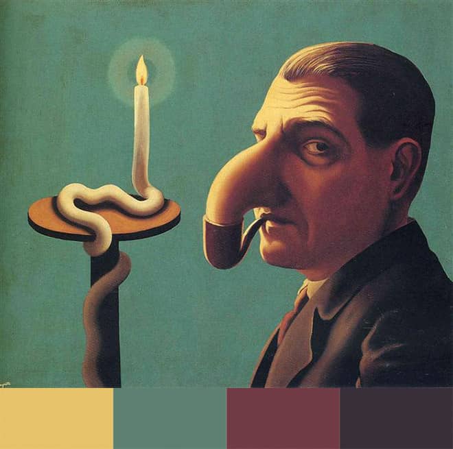
I also like the colors in contrast. The contrast is not very high, but enough to be appealing. I didn’t know the philosopher’s face was that reddish, until I put the colors on the contrast palette!
We don’t know if his nose or head is real. Maybe it’s just a smoke and only the lamp is real. Magritte’s work makes people question – that’s what we love and never get bored with.
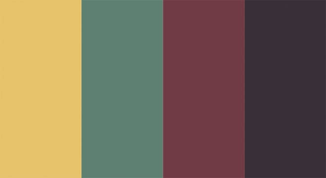
Make a contrast color scheme
I use Adobe Illustrator to pick colors and make my palettes. Maybe a mobile app like Pantone Studio is more accessible for the most of you who don’t use Illustrator for your works. I summarized today’s contrast color palette like below.
- CMYK: 12, 25, 64, 0 | 69, 43, 57, 0 | 58, 83, 65, 21 | 78, 79, 66, 42
- Web: #E6C26A, #5D8072, #713B45, #383039
- Mood: contrast but harmonious, in a sophisticated way
Contrast palette with surreal lamp
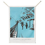
Magritte made his living producing advertising posters (and even creating forgeries of Picasso, Braque and Chirico paintings as well). They look quite different from the surrealist paintings that we know as Magritte’s style, which often featured unexpected combinations of objects, playing on reality and illusion.
Fortunately, I could find colors in the surreal lamp, not the dresses on the posters (you can see them on Wikiart).
It’s worth to visit Wikiart and enjoy more works of Rene Magritte, even including the advertisement. He painted common images in uncommon context and questioned your perceptions of reality. Sounds proper to contrast colors in a conceptual way!
More surrealist art by Rene Magritte
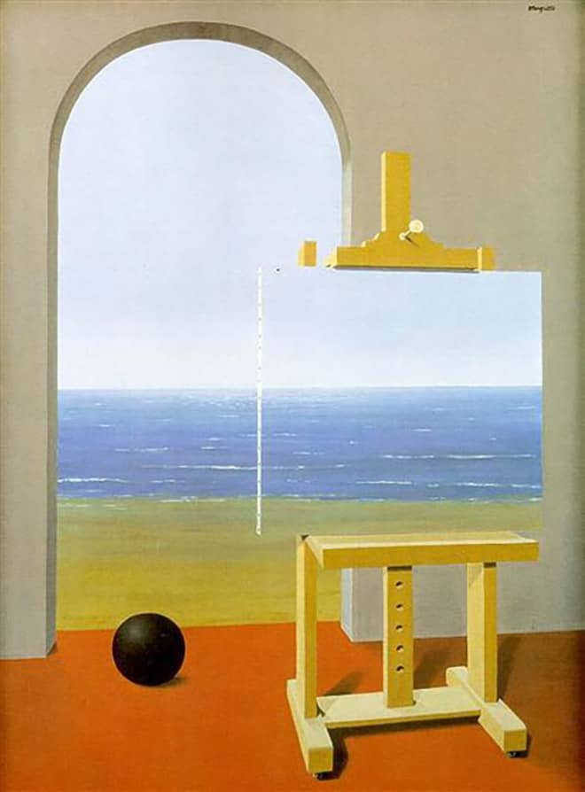
Here I brought another painting titled “The Human Condition” by Rene Magritte. There are two Magritte’s pictures with the same title, and this is one of them. I think an image of “open window” (with a little bit of mystery) is good for the beginning of the year.
Maybe your favorite artist and painting come to your mind when you think about contrast color combinations or other color schemes. Then you can start with the artist – bring their aesthetic colors and make your art-inspired palette.
Other color schemes in art
I also linked an article of the “melancholy” palette by Chirico from my old blog, replay404.com, that you might be interested.
I think I’ll make a new palette with another surrealist artist, maybe something fresh like sprout when the spring comes.
It’s been quite a long time (more than 20 years!) since I’ve visited Brussels. Magritte was known to be a private person and lived a relatively normal life in Brussels, where he spent most of his career.
So it would be nice to imagine travelling to Belgium while searching the art of the mysterious Belgian surrealist. Visiting Magritte museum would be on my wish list in the new year.
Deep autumn color palette inspired by Rousseau
Soft autumn palette inspired by Edward Hopper

