Autumn palette of the great artist
Isn’t autumn too short? It is, at least in Korea. So I’d like to make an autumn color palette and say goodbye to this beautiful, unfortunately short season.
The artist for today’s color combination is Edward Hopper, definitely one of my favorite artists.
I think Chop Suey, the title of the picture, is kind of less desolate (relatively) for Hopper’s work, maybe by the light on the image. Although that “desolation” is what I love so much in the paintings of Edward Hopper, it often makes me feel sad.
So the brighter colors and less lonely atmosphere, let me pick this picture for a soft autumn palette that we may need to get through the upcoming winter.
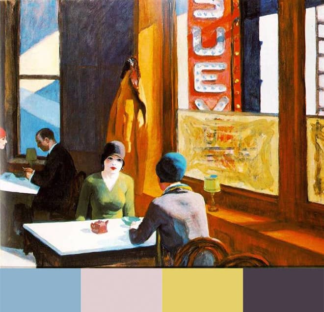
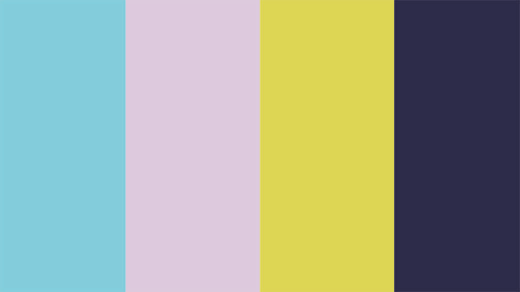
The color scheme is generally soft with the light colors, but the dark purple makes it well-balanced, not too soft – which looks fashionable to me. I think I picked the right colors from the two ladies and the café.
Soft, cool autumn color palette
I use Adobe Illustrator to pick colors and make my palettes. Maybe a mobile app like Pantone Studio is more accessible for the most of you who don’t use Illustrator for your works. Here I summarized today’s soft autumn colors like below.
- CMYK: 49, 20, 14, 0 | 13, 21, 13, 0 | 13, 16, 67, 0 | 75, 76, 60, 27
- Web: #8DB4CC, #E1CFD1, #E5D068, #493D49
- Mood: soft and cool (not cold), in a fashionable way
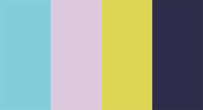
Make your artistic autumn palette
Although Hopper didn’t paint touristic places or something on this picture, it makes us feel that we are travelling along the artist’s point of view.
Travelling an unfamiliar city, having a cup of coffee at the café called Chop Suey, and then looking around curiously the ladies in similar hats…
Maybe your favorite artist and picture come to your mind when you think about the colors for autumn. Then you can start with the artist – bring their aesthetic colors and make your art-inspired palette.
I hope my palette can encourage you to do – you see, it’s easy to pick the colors inspired by the great artists! You can start from their artistic senses of colors and apply your changes.
More works and colors from Hopper
I also want you to visit Wikiart and enjoy more works of the artist – then you’ll understand why I said Chop Suey was less desolate. This time my recommendation isThe Barber Shop, one of my favorite “people at work” paintings by Hopper.
Of course, you can see them sometime next, if you don’t want to feel the sorrow of urban life right now. But you know, art is not always happy.
Edward Hopper’s “without people” landscapes are strangely beautiful as well, but I like “with people” ones more.
Actually, it makes us feel lonelier with the people on those pictures. Maybe it’s because we can feel the deep loneliness of them, or by them, with the details that are beautifully portrayed.
I also made another autumn palette from the colors on The Barber Shop. I can say this one is a deep autumn palette with the tranquil, toned-down colors that make you sit down and take a breath.
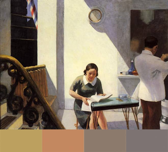
Other palette inspired by Hopper
I also linked one more article of the colors by Edward Hopper from my old blog, replay404.com.
This new blog will be filled with new articles focusing on colors inspired by artists, like I wrote on the ex-blog.
Previously European cities with Chirico, then the American cities (actually city lives) with Hopper – hope to travel somewhere far from my city after this autumn.
Until then, travelling into pictures and playing with colors would make me feel somewhere new in a way.
Special options for PLA filament colors
Yellow and green color palette from Chirico
